6 most common mistakes in website development

More and more often, it’s surprising why business owners fail to realize that a website is the "face" of the company. It’s the first place potential customers interact with your business.
There’s a well-known saying: “First impressions matter.” In the modern world, we could update this to “judged by your website.” So why do many people ignore this and create or commission a website just for the sake of having one? It’s a rhetorical question. Let’s figure out what a website needs to inspire trust and grab visitors’ attention from the first few seconds. These rules are obvious, but unfortunately, often neglected.
1 - Lack of a slogan
The first thing users notice is the top left corner of your website. This is where potential clients expect to see the logo and a brief slogan answering the question, “Where am I?” The slogan should be specific. For example, if you’re looking for transportation services, compare two options: “Our clients’ success is our success” vs. “Freight transport across Russia.” Which one clearly reflects the company’s purpose? Where will users instantly know they’ve landed on the right site? Of course, the second option. The main goal of this element is to give visitors a clear understanding that they’re in the right place. A concise and clear slogan plays a significant role in how the site is perceived.
Always ensure that your slogan, alongside your logo, is clear, brief, and reflects the essence of your business.

2 - No phone number or operating hours in the header
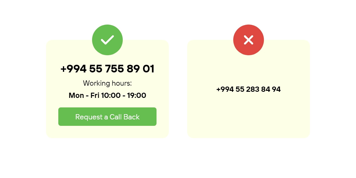
This recommendation is often ignored: either the contact information isn’t displayed, or it’s shown in too small a font. Sometimes the contact block is represented by a low-quality image. For sales-oriented websites, this is unacceptable. The phone number should be a landline, as displaying only a mobile number undermines trust and gives the impression that the company isn’t serious.
Many also forget to include the business’s operating hours. This is particularly important for online stores, where customers may need to check their orders. A callback option is also essential, especially if visitors land on the site outside working hours.
Always place contact details and operating hours in the top right corner of the website. The phone number should be prominent and displayed in a large font.
3 - Search functionality not easily visible
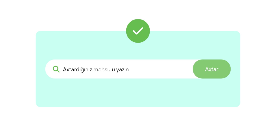
This critical aspect is often overlooked by website owners. While not all sites need a search function (e.g., simple business card websites), it’s essential for online stores and websites with large amounts of information. Unfortunately, many online stores either don’t have a search function or place it at the bottom of the page, making it difficult to find.
If your site contains a lot of information or products, be sure to include a search bar and place it in a prominent, easily visible spot.
4 - Uninformative contact page
The "Contact Us" page is one of the most crucial elements of a website. If a user reaches this page, it means they are highly interested and want more information, such as operating hours or the company’s address. Therefore, it’s important to make this page as helpful and clear as possible.
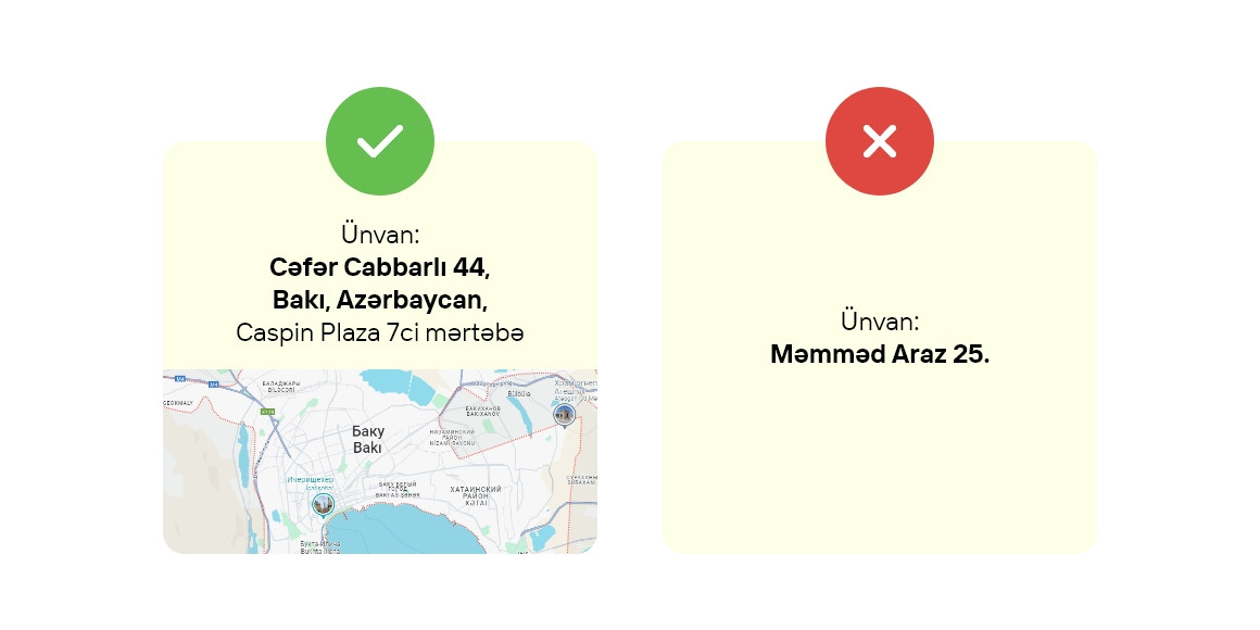
All contact details should be listed: phone numbers, address, email, and other communication methods. Be sure to include a map showing the location of your office. The more accessible and detailed the information is, the better for the user. Adding photos of the building’s facade and directions is a nice touch.
5 - Missing "Clients" or "Testimonials" page
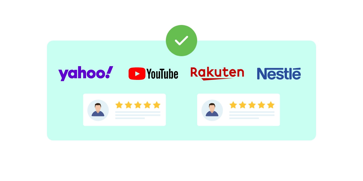
Building trust is crucial for users who are considering doing business with your company or purchasing your products. Pages showcasing your clients and testimonials help potential customers feel assured of your company’s reliability. It’s important for testimonials to be genuine, not fake. Additional trust is garnered from official recommendation letters from clients.
Showcase partner logos and client testimonials on your site. The best option is to display testimonials on official client letterheads with seals.
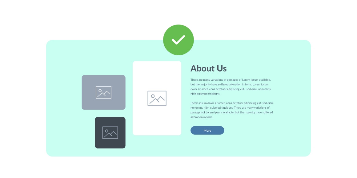
6 - Uninformative "About Us" page
The "About Us" page is one of the most important on your website, second only to the "Contact Us" page, yet it is often given insufficient attention. The main goal of this page is to build trust. Visitors need to know they’re dealing with a reputable and transparent company. Use this page to present a company overview, describe your operations in detail, highlight advantages, and list key contacts. Be sure to include the company’s legal information to emphasize its legitimacy and reliability.
Don’t hide behind a simple contact form. Show that your company is "alive." Users appreciate that.
Conclusion
By addressing these elements, you can significantly boost your website’s credibility and improve how users perceive it. This will lead to higher conversion rates and increased sales. We hope our tips will be useful and help improve many websites.
Wishing you high sales!


